How can I make real-looking product photos with AI?
Photograph your product, remove the background free on your own computer, then describe the scene you want in PromptWise: where the camera sits, what's in front and behind, where the light comes from, which lens. Upload your photo as the reference, so the AI copies your product instead of inventing one. One generation, 4 credits.
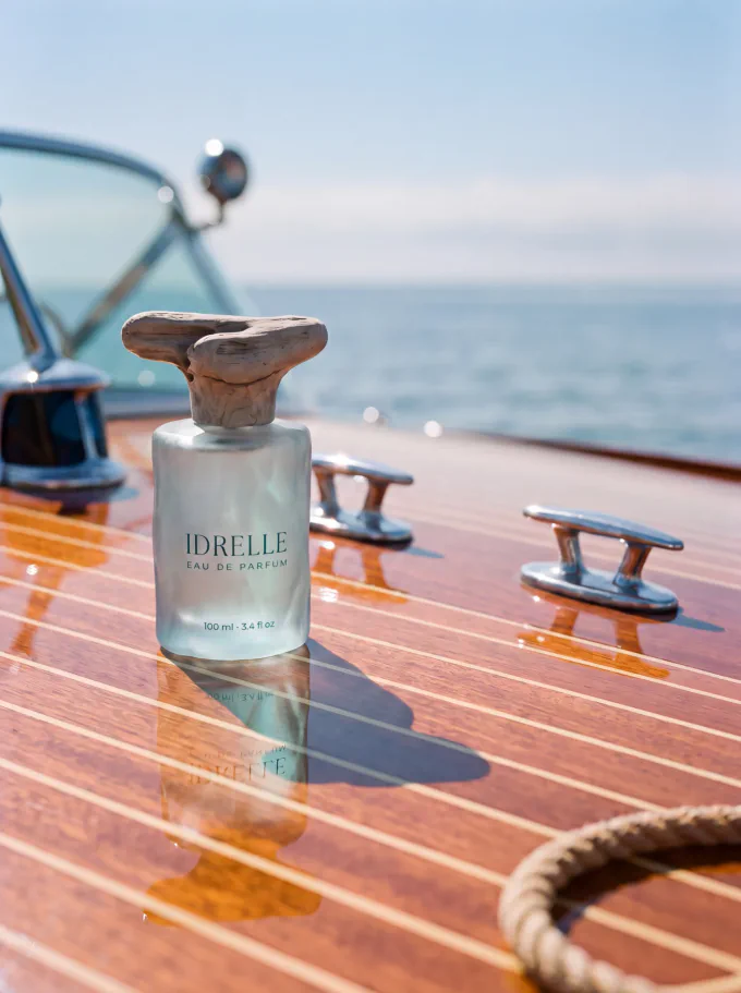
 Open PromptWise to follow along (opens in a new tab)
Affiliate link — we earn a commission if you subscribe, at no extra cost to you.
What do you need before you start?
- One photo of your product, taken on your phone in daylight
- A computer with a background remover — the one already built into Windows Photos or Mac Preview is fine, and it's free
- A PromptWise account
- 4 credits for one generation
You get 50 credits for 7 days, and you can cancel before it ends. Use them this week — here's the order we'd shoot in: one hero shot like this one, then the same product on two other surfaces, then a close-up. Four shots, and you've got a month of feed.
A note on our bottle. Idrelle is a brand we invented, and the bottle in every photo here is AI-generated — we make our demo products so we can show you the whole process without a client's product in it. Your product is real, which is the easy version: you can photograph it. Everything below works the same either way.
How do you make it, step by step?
-
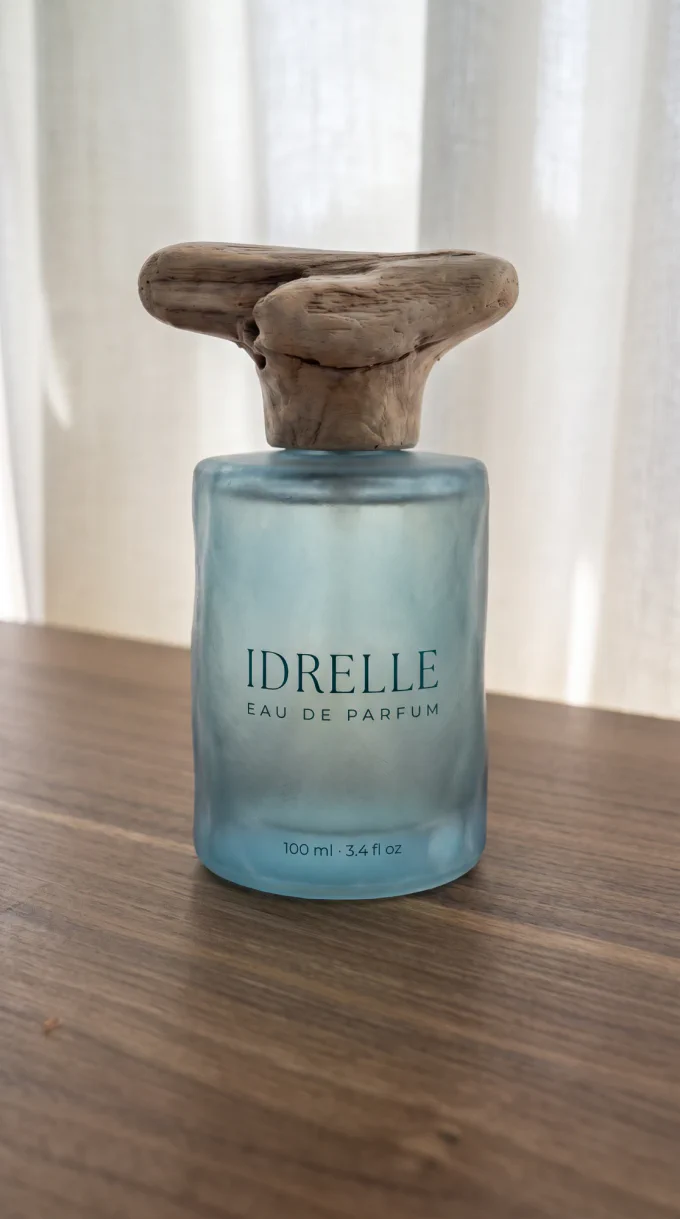
Take one photo of your product
Daylight, product centered, plain surface. Near a window with the overhead lights off is better than any lamp you own. You're not making the final image here — you're giving the AI a clear look at what your product actually is, so shoot it straight on and in focus.
One photo is enough. If your product has a label, make sure the label faces the camera and you can read it.
-
Remove the background, free, on your own computer
Skip this and the AI will sometimes drag your kitchen counter into the shot along with the product. Do it and your reference is nothing but the product itself.
You don't need Canva, a subscription, or a single credit. Your computer already does this:
- Windows: open the photo in Photos, then Background → Remove
- Mac: open it in Preview and use the markup tools, or right-click the image in Finder and choose Quick Actions → Remove Background
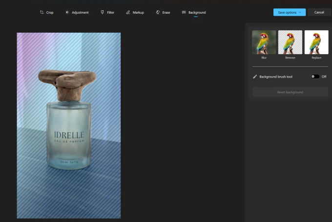
AI-GENERATED Those diagonal stripes are the tool showing you what it thinks the background is. Check they cover everything except your product before you go further — if they've crept onto the product itself, the Background brush tool lets you paint the selection back.
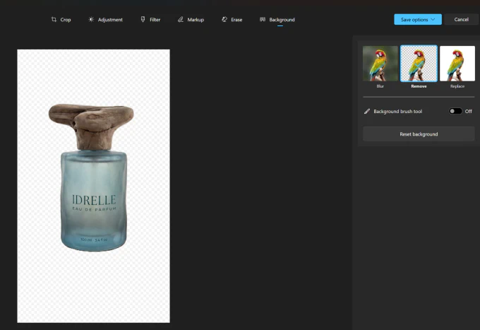
AI-GENERATED Save it as a PNG so the transparency survives.
A white background works nearly as well if your tool won't do transparency. In Windows Photos that's Replace, with the color set to
ffffff: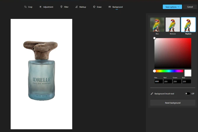
AI-GENERATED Why this matters more than it sounds. This one file becomes the reference for every shot you make from now on — this guide, your next launch, your Black Friday set. Get it clean once and your product looks identical across all of them. That consistency is the whole difference between a shop that looks like a brand and a shop that looks like a camera roll.
-
Describe a photograph, not a product
Why do AI product photos come out flat, and how do you fix it?
This is the step that decides everything. Most AI product photos fail here, and they fail the same way: the prompt describes a product when it should describe a photograph.
Here's the prompt we started with:
PROMPT
The perfume bottle from the reference image, unchanged, standing on the varnished teak deck of a small wooden sailboat, open sea and a soft horizon line behind it, golden-hour sun from the left, gentle deck shadow, faint sea spray texture on the wood, editorial fragrance packshot, real product photo taken with a 50mm lens, visible material texture, not a 3D render
Not bad. It names the product, the surface, the light. But it's missing most of what a photographer decides before pressing the shutter, and what comes back is flat — a product floating in a nice place, with nothing in front of it and nothing to give the scene depth.
What does every product prompt need?
Eight things. Miss the middle ones and you get a catalog cut-out; include them and you get a photograph.
What to specify Why it matters From our prompt Camera position Decides whether the viewer is standing over the product or sitting with it Eye-level, close to the subject, slight low angle Product position Stops the AI centering everything like a passport photo On the left third of the frame Foreground The one most people skip, and the one that creates depth Out-of-focus coiled rope, close to the lens, lower right Midground Where your product lives, and what stays sharp The bottle, sharp focus Background Gives the scene a place and a story Open sea, horizon falling away right, thin haze Lighting Direction, hardness, time of day, color temperature Hard direct midday sun, single source, camera-left, warm-neutral Camera and lens Changes the whole feel — a phone and a medium-format camera see differently Hasselblad medium format, 50mm, f4 Intent and texture Tells it what kind of picture this is Editorial fragrance packshot, warm film grain, not a 3D render You don't need to know camera names. We don't either. Describe the feeling you want — "expensive and still", "sunlit and casual" — and ask Wise Chat inside PromptWise, or ChatGPT or Claude, which camera and lens give that. Then put its answer in your prompt.
What does the finished prompt look like?
PROMPT
Eye-level, camera close to the subject, slight low angle. The Idrelle perfume bottle from the reference image, unchanged, positioned on the left third of the frame, standing on a varnished mahogany-teak boat deck with chrome bow fittings. Foreground: the out-of-focus edge of a coiled rope on the deck, close to the lens, lower right corner. Midground: the perfume bottle, sharp focus. Background: open sea and a soft horizon falling away to the right, thin haze over the water separating sky from sea, a navy-and-white striped cushion barely visible and blurred at the frame edge. Lighting: hard direct midday sun as the single source, camera-left, warm-neutral color temperature. A sharp-edged shadow falls to the right of the bottle. A thin bright specular highlight runs along the glass shoulder; the sea-glass glass transmits light and casts a faint teal-tinted glow onto the teak beneath it. The chrome bow fitting throws a hard mirror-like highlight. The teak deck has a satin sheen with visible grain. The striped cushion fabric stays soft and matte, absorbing light rather than reflecting it. The label reads "IDRELLE", with "EAU DE PARFUM" below it and "100 ml · 3.4 fl oz" near the base. Shot on a Hasselblad medium-format camera, 50mm lens, f4, the bottle and near deck sharp, the horizon and cushion falling soft. Warm film grain, editorial fragrance packshot, real product photo, visible material texture, not a 3D render.
Swap the highlighted parts for your own product and scene. The structure stays.
The five words that do the most work: from the reference image, unchanged. That's what tells the AI to copy your product instead of inventing one that matches your description. Leave them out and you'll get a bottle that isn't yours.
-
Generate it in PromptWise
Open PromptWise and go to Studio in the left sidebar. Upload your background-free product photo as the reference. Then four settings:
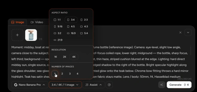
AI-GENERATED Setting What we used How to choose yours Model Nano Banana Pro Nano Banana Pro and ChatGPT 2.5 Sunburst are the strongest right now for product work. Older models cost less, but results differ enough between models that a cheap test isn't always a fair test Aspect ratio 3:4 3:4 for the Instagram feed, 9:16 for reels and stories, 1:1 for a listing Resolution 4K Test at a lower one if you like, but upscaling later costs more than generating big once. If there's a person in the shot, always go highest Number of images 1 Generate 2 or more. The first image is hardly ever the winner, and comparing two teaches you more than staring at one. We generated one here because we only wanted to test the lighting That run cost 4 credits.
 Try this prompt yourself (opens in a new tab)
Affiliate link — we earn a commission if you subscribe, at no extra cost to you.
Which model should you use?
We ran the same prompt twice with the same settings — 3:4, 4K, one image — and changed only the model.
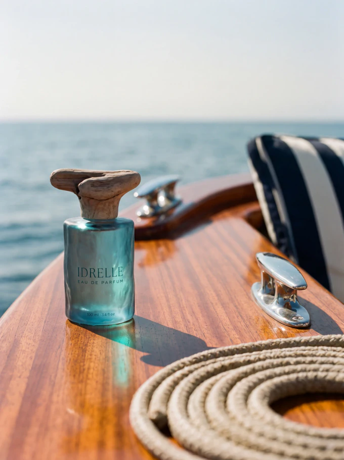
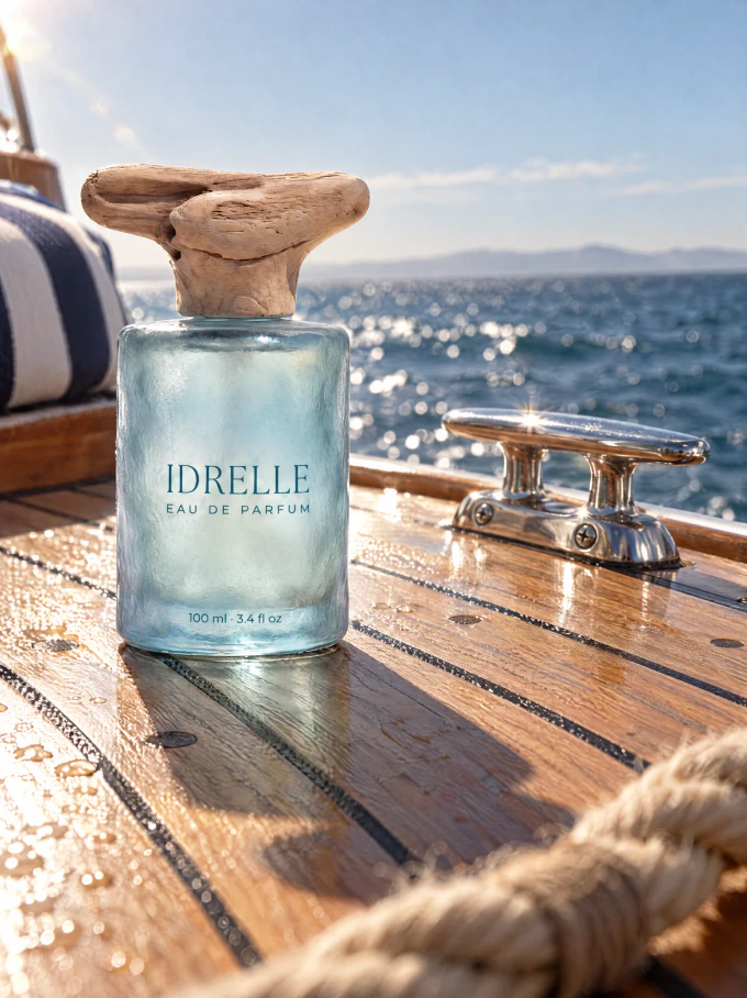
| Nano Banana Pro | ChatGPT 2.5 Sunburst | |
|---|---|---|
| Credits | 4 | 4.5 |
| The label | Wrong — "34 fl oz" | Correct |
| The product | Kept the squared shape and the smooth frosted surface | Turned it into a round cylinder with icy, near-transparent glass |
| The light | Good | Better — wet deck, sparkle on the water, a real sun flare on the chrome |
| The foreground | Rope competed with the product | Rope sits lower and softer, framing instead of fighting |
Neither one won. One got our product right and our text wrong. The other got our text right and our product wrong.
That's the lesson worth taking: there's no best model, only different failure modes. Pick one, learn what it tends to get wrong, and check that thing every single time. If your product has a distinctive shape, check the shape. If it has a label, read the label. If it has a color you chose deliberately, hold it against the reference.
What we'd do with both: generate in whichever model holds your product's shape, then fix the text separately using the label edit below. Shape is hard to repair; text is easy.
And there's a third way, which is how the shot at the top of this page was actually made. Both of the images above were built from a written description of the bottle, which is why they disagree about what the bottle is. For the final one we trained the bottle as a reusable seed in PromptWise — a handful of photos, trained once, free — so it stops being a description and starts being a photograph. If your product has a distinctive shape, a specific color, or printed text, that does more for you than switching models ever will. It's the subject of our next guide.
What if your product isn't a perfume bottle?
The structure holds for anything. You change the scene clauses and leave the rest alone.
Skincare or beauty — swap the deck for a wet stone at a shoreline, or crumpled linen with palm shadows across it. Keep the single hard light source; it's what makes glass and cream look expensive.
Jewelry — dark surfaces, low raking light, deep shadows. Trade "hard direct midday sun" for "low directional light from the right", and "warm film grain" for "deep soft shadows, glinting highlights". Small products want a closer lens and a tighter frame.
Clothing and soft goods — flat, matte, daylight. These don't reward drama, they reward clarity. Move the camera up, shoot closer to top-down, keep the light soft and even.
Food and drink — keep the foreground but make it edible: crumbs, a linen edge, a second glass out of focus.
Which three clauses are worth changing on their own?
Each of these changes the whole picture, one at a time, so you learn what each one actually does:
- The surface. Teak, travertine, wet sand, dark marble, crumpled linen. This does more than any other single word.
- The light direction. "Camera-left" to "from behind" turns a product photo into a silhouette with a glow. "Hard" to "soft, diffused through a sheer curtain" turns midday into morning.
- The foreground. Change what's blurred in front and the mood changes without the product moving at all.
What about a different platform?
Same prompt, different aspect ratio. Generate the 3:4 for the feed, then regenerate at 9:16 for reels rather than cropping — cropping a 3:4 to 9:16 cuts your composition in half and puts the product somewhere you didn't choose.
Why does your AI product photo look wrong?
Your label comes out as nonsense
Ours read "34 fl oz" where it should have said "3.4 fl oz" — a number that doesn't exist, printed confidently on a bottle. AI renders small text as plausible-looking text, and numbers are the worst case, because a wrong one looks exactly as real as a right one.
The fix: write the exact text in the prompt, character for character. The label reads "IDRELLE", with "EAU DE PARFUM" below it and "100 ml · 3.4 fl oz" near the base. Then read every character at full size before you publish. Volumes, prices, ingredients, percentages — those are the ones that cost you a customer.
When it still comes out wrong. Spelling the text out improves your odds; it doesn't guarantee them — sometimes a line comes back altered, and sometimes it doesn't come back at all. Small text is the last thing these models get right, and below a certain size in the frame it may never come out clean. Three moves, cheapest first:
1 · Regenerate with the text spelled out. Often enough on its own, and it costs you one more generation.
2 · Edit only the text, on an image you already like. Don't regenerate the whole scene — you'll lose the light you just spent credits getting. Ask for the text alone.
This is what we did on the photo at the top of this page. The first generation dropped the volume line entirely — "IDRELLE" and "EAU DE PARFUM" came out perfectly, "100 ml · 3.4 fl oz" simply wasn't there. Rather than reroll the whole shot and risk the light, we asked for that one line and nothing else:
PROMPT
Keep everything exactly the same (boat, deck, cleats, lighting, composition, sea, rope), but restore the missing third line of printed text on the bottle: "100 ml · 3.4 fl oz", in small dark teal sans-serif print, centered near the base of the glass, below "EAU DE PARFUM", exactly as in @idrelle_eau_de_parfum . Do not change "IDRELLE" or "EAU DE PARFUM". No other text changes. Close-up product photograph, eye level with a slight low angle, camera near the base of the windshield looking toward the bow. The bottle (about 12 cm tall with the cap) stands upright on the varnished foredeck, in the left third of the frame, label facing the camera, with a soft faint reflection of its base in the varnish. Behind it, the two chrome cleats sit softly out of focus, one catching a hard mirror-like highlight. Background: calm open sea, a level soft horizon, thin haze between sky and water. Foreground, lower right corner only: a small, thin portion of loose natural-fiber rope, about 1 cm thick, cropped by the frame edge, heavily out of focus, muted and warm in tone. Lighting: hard direct midday sun, single source, from camera-left, warm-neutral. The frosted glass glows softly and evenly with no hard reflections, and passes a faint pale-aqua light onto the wood beside it. The glass casts a soft, translucent, slightly aqua-tinted shadow to the right; the driftwood cap casts a short, sharper shadow to the right. Mahogany has a satin sheen and visible grain, driftwood stays dry and matte, chrome gives crisp mirror highlights. Hasselblad medium format, 50mm, f/4. Bottle, label and near deck tack sharp; cleats, rope and horizon fall soft. Natural color, fine film grain, editorial fragrance photography, real product photo, visible material texture. 4:5.
Two things worth copying from that. The whole scene is restated in detail even though none of it was changing — that's what stops an edit quietly redecorating everything around the part you asked for. And @idrelle_eau_de_parfum is a reusable seed: a set of photos of the bottle, trained once in PromptWise, free, that the AI reads instead of guessing from adjectives. Seeds are the real answer to a product that keeps changing, and they're getting a guide of their own shortly.
3 · Put the text on there yourself. Open the image in Canva, place your real logo file and label text over the product, match the curve and knock the opacity back slightly so it sits on the surface instead of floating above it. Two minutes, works every time, and it's what product photographers have done for decades — retouching a label isn't cheating, it's the job.
The rule that decides which one you need: a label too small to read is fine. A label that's readable and wrong is not. Zoom to full size and read every character before you publish.
The AI changed your product
You described your product beautifully, and it made you a different one that matches the description.
The fix: stop describing, start pointing. Upload the reference image and say the product from the reference image, unchanged. Every adjective you add is permission to reinvent; every "from the reference" is a lock. Describe where to look, not what it looks like. The stronger version of this is a trained seed, which is free and which the next guide covers.
The photo is flat and boring
Nothing in front, nothing behind, product floating in the middle. This is the missing-foreground problem, and it's why most AI product photos look like AI product photos.
The fix: name a foreground, a midground and a background separately, and say which one is sharp.
Your kitchen counter turned up in the shot
The AI took your reference photo's background as part of the brief.
The fix: step 2. Remove the background before you upload.
It came back a different shape than you asked for
You uploaded a 3:4 and got back something taller, cropped at the sides, with invented extra scenery top and bottom.
The fix: set the aspect ratio explicitly in the settings, and add keep the original image's aspect ratio and framing to the prompt. Don't leave it to chance.
What else do people ask about AI product photos?
How much does one AI product photo cost?
This one cost 4 credits in PromptWise: 4K resolution, Nano Banana Pro, one image. More images at once multiplies that; lower resolutions cost less. PromptWise starts you with 50 credits for 7 days, roughly a dozen shots at this quality. The trial asks for a card and you can cancel before it ends.
Will the AI change my product?
Not if you upload a photo of it and write "from the reference image, unchanged" in your prompt. It changes your product when you describe the product in words instead of pointing at the reference — then it builds something that matches your description rather than copying what you have. Always upload, always reference.
Do I need a good camera to take the reference photo?
No. A phone photo in daylight is enough. The reference only has to show the AI what your product is: its shape, color, material and label, in focus and facing the camera. The final image quality comes from the generation, not from your phone.
Can I use these photos on my Shopify or Etsy listing?
Check each platform's current rules on AI-generated imagery before you list, because they change. Whatever the rule, the honest test is the same: the photo must show what the customer actually receives. A scene you invented is fine. A product that looks different from the one in the box is not.
Why does my AI photo look fake even though the product is right?
Almost always a missing foreground and a vague light source. Real photographs have something close to the lens and out of focus, and light that comes from one identifiable direction at one time of day. Name a foreground, a midground and a background separately, and state where the light comes from and how hard it is.
Do I have to tell people the photo is AI?
We label every image we publish, and platforms increasingly require it — Instagram, TikTok and others have their own AI labels. Rules vary by country and platform, so check what applies to you. Our own rule is simpler than any regulation: if a customer would feel misled seeing it, say so.
Get PromptWise (opens in a new tab)
Affiliate link — we earn a commission if you subscribe, at no extra cost to you.
What should you make next?
Last updated